Brand Standard · v1.0 · September 2026

Vertical Construction Group
Brand & Style Guide

Everything in this guide is derived from the logo itself — its letterforms, its inks, its proportions. Where the logo and this document disagree, the logo wins.

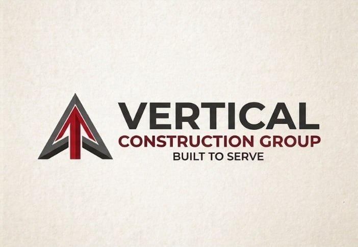
Vertical Construction Group logo, landscape
The wordmark is set in Raleway — identified by geometric match against the original type, not a font name in the file. The logo is pure vector; the typeface below is its closest licensed match.

01 · The Wordmark

Raleway

The logo's text is a geometric sans with a distinctive condensed weight range: heavy 800-cap for the name, tracked 600-cap for the descriptor. Two independent letterform comparisons (C-terminals, R-legs, V-apexes, cap proportions) selected Raleway from ten candidates. It ships with a full weight ladder, which is why it carries the whole site.

Vertical Construction Group
Raleway 800 / 600
line 2 at 31% size
tracking +0.52em

Logo facts (measured)

  • One family, two weights: 800-class name over 600-class descriptor
  • Line 2 is 31% the height of line 1, set in wide caps
  • Monogram: faceted V — steel bevel #5B5A58, oxblood fill #721017, burgundy accent #A31E22

Website headers

  • Raleway 700–800 for all headings and the nav wordmark
  • Uppercase + tracking only for eyebrows/kickers, never for full headings
  • Never italicize a heading — the mark is upright, so the voice is upright

Body & UI text

  • Inter 300–500 for paragraphs, lists, forms, buttons
  • Inter is the neutral counterweight: Raleway speaks, Inter explains
  • Line length 60–75 characters; line-height 1.75

02 · Color

Five colors, straight from the logo master

These are the exact fill values defined in the SVG master file — the source of truth. PNG samples drift; the vector doesn't. Nothing else enters the palette without replacing one of these.

Charcoal
#231F20
Primary. "VERTICAL" wordmark. All headings, hero and footer backgrounds. Near-black with a faint red cast — that warmth is the brand.
Oxblood
#721017
Accent. "CONSTRUCTION GROUP" line and the monogram's lower fill. Links, buttons, kickers, active states. Deep enough for white text at AA contrast.
Burgundy
#A31E22
Signal. The monogram's accent facet. Hover states, highlights, and emphasis where oxblood would be too dark. Use sparingly — it's the spark, not the engine.
Steel
#5B5A58
Support. The monogram's bevel facets. Secondary text, borders, icons, muted UI. The concrete-and-rebar tone of the brand.
Cream
#F4F0E8
Ground. Logo background. Page backgrounds. Warm paper, never pure white — the site should feel like a job-site drawing, not a SaaS dashboard.
CHARCOAL #231F20  ·  OXBLOOD #721017  ·  BURGUNDY #A31E22  ·  STEEL #5B5A58  ·  CREAM #F4F0E8
on-cream text: charcoal  ·  on-charcoal text: cream  ·  interactive: oxblood  ·  hover: burgundy

03 · Type Scale

One voice per element

Raleway for statements. Inter for substance. The scale below is the whole system — new sizes should snap to the nearest row.

H1 · 44/800
Built to serve, built to last.
H2 · 30/700
Commercial & industrial construction
H3 · 21/700
Current projects across the region
Body · 16.5/400
Vertical Construction Group delivers design-build and general contracting services for commercial, industrial, and institutional clients. Every project is managed in-house from bid close to final walkthrough.
Small · 13/400
Footer, captions, legal copy, and form helper text. Muted steel-gray on cream, never below 12px.
Kicker · 12/700
SECTION EYEBROW — UPPER CASE

04 · Logo Usage

Clear space, minimum size, and the rules that protect it

Square logo on cream
Primary — square mark on cream or charcoal. Use in headers, social, documents.
Landscape logo on cream
Landscape — mark + wordmark. Use in footers, email signatures, site headers at 44px+.

Do

  • Place on cream or charcoal — the two surfaces the mark was drawn for
  • Keep clear space around the mark equal to the height of the "V"
  • Reproduce at 44px height or larger
  • Use the provided files exactly as supplied

Don't

  • Don't recolor — no gold, no blue, no gradient washes over the V
  • Don't rotate, stretch, or outline the monogram
  • Don't place on busy photography without a cream or charcoal plate
  • Don't set the wordmark in any typeface but Raleway
  • Don't add effects: shadows, bevels, glows, textures

File sources

  • vcg-logo.jpg — square, for avatars and small placements
  • vcg-logo-landscape.png — transparent, headers and signatures
  • vcg-logo-landscape.svg — vector master; the only file for print and large formats

05 · Voice

Built to serve

The tagline is the voice in four words: direct, competent, unshowy.

How we write

  • Short sentences. Concrete nouns. Numbers where a number is true.
  • Lead with the work, not the adjectives — "40,000 sq ft" before "state-of-the-art."
  • No exclamation marks in body copy. The work is the proof.

What we avoid

  • Construction clichés: "building dreams," "turning visions into reality."
  • Superlatives without a claim behind them.
  • Jargon that doesn't survive a client conversation.